Top Things to Keep in mind when Designing a Logo for your Startup
As a startup, your logo can make or break your business, since it is an expression of the company’s brand promise and is the first interaction people have with your brand. As such, your logo should convey a clear and understandable message to your audience and should be memorable and timeless. If you are just starting out, here are some tips to keep in mind to achieve a great logo that will stand the test of time.
Keep your Audience in mind
Before you get down to designing a logo design Dubai, you need to understand who your target audience are, and learn about their social, economic, educational, and cultural backgrounds, to understand them better. Knowing your audience better helps you understand their preferences, which influences your logo’s design elements. Afterall, you want a logo that resonates with your target audience and makes them interested in your products/offerings. For instance, if your ideal customer is a teenager, you would want your logo to incorporates fun and quirky elements, but if your target audience are corporate executives, you would want a more professional look and feel.
Choose the Right Logo Type for your Business
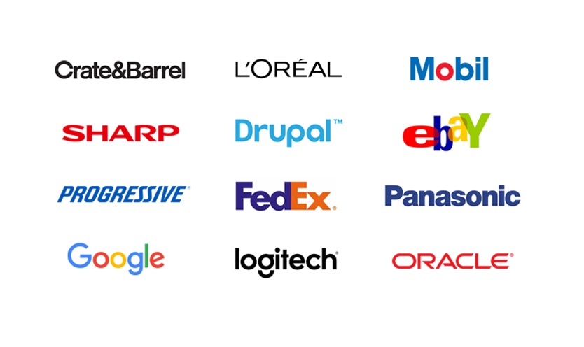
Wordmark: Wordmark or logotype is a font-based logo that simply includes your business’s name (Think Google, Subway, Drupal, Tiffany & Co. and Oracle). If your business name is catchy, memorable, and unique, these logotypes drive brand recognition faster. Not only are these logos easier to use, they are totally font-based, which means that you can choose a font reflective of your brand’s personality. For instance, fashion brands usually use clean, scripted fonts to exude a high-end, luxurious feel, while government agencies use heaver, block-based fonts.
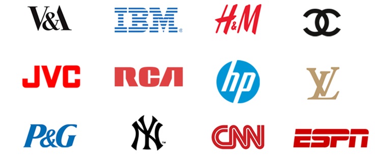
Letter marks: Logomarks are logos that are only made up of a brand’s initials (Think HBO, ESPN, NASA, HP, LG and IBM). These no-fuss, no-frills logos are best for transforming your long business name into an identifiable brand identity. Not to mention, in an era where acronyms are all the rage, monograms work best for representing organizations with an already established name. However, when using letter marks for a new business, it is advised to use your full business name under your logo on branding materials to help people make the connection.
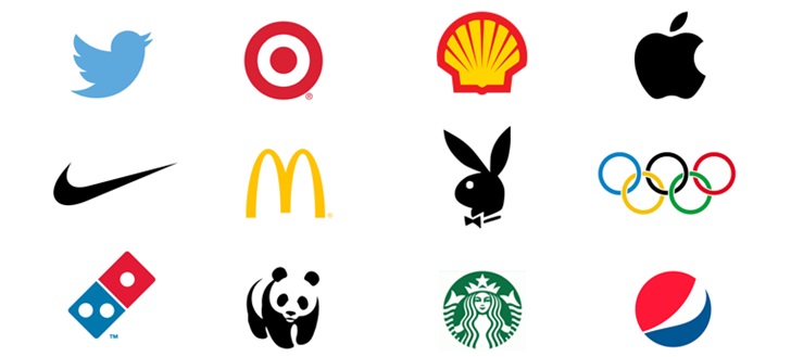
Pictorial: We know that the human brain processes visual information faster than text, which is why some brands choose icons/graphic symbols for their logos (Think the apple logo, the snapshot ghost, the Instagram camera, and Twitter bird). Logomarks are clean-cut, memorable, and are great for sending a clear message to your audience. Brands can play on their brand name, such as John Deere’s deer logo or Target bull’s eye logo, or evoke an emotion, such as the WWF’s depiction of a panda.
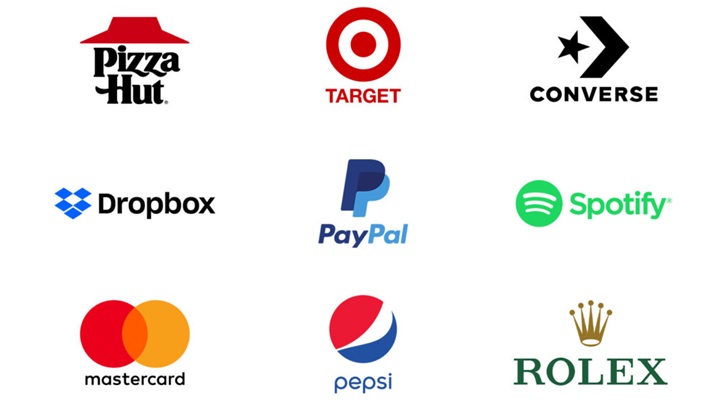
Combination Marks: As the name suggest, these types of logos incorporate both symbols and words into a spectacular design (Pizza Hut, Puma, Burger king, CVS, Taco Bell, KFC, Rolex, Lacoste). This logotype works best for startups since they can use both their name, as well as a graphical representation of what their business is about, to reinforce their brand. As your brand becomes more recognizable, people will associate it with the pictorial mark and you can drop the name altogether in a design, such as Nike’s famous swoosh.
Design for Usability
Your logo may look good on your website, but have you considered the future use of your logo? As your business expands and prospers, you will want place your logo on marketing collateral such as business cards, posters, flyers, mugs and stationery, as well as billboards, social media pages, and email signatures. When thinking of a logo design for your startup, it is important to determine how your logo will appear on different mediums. Something that looks good on a business card or a website might not render well when placed on a large billboard or on the side of a truck.
Be careful with colors
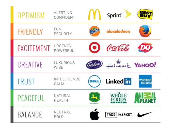
When choosing the right colors for your logo, remember that different colors have different connotations and colors can be used to evoke the desired feelings. For instance, the color red is often associated with aggressiveness, love, passion, while pink symbolizes tenderness and femineity. Yellow exudes a friendly, cheerful, youthful, and happy vibe, while blue denotes trust, reliability, loyalty, and sophistication. Purple is a natural choice for luxurious, high-end brands, while green is often the first choice of eco-friendly, vegan, and natural wellness brands. Think about the associations you’d like people to make with your brand as well as what your brand symbolizes, before choosing colors for your logo.